Adding Some Style
Published:
Filed under: Rovani's Vue
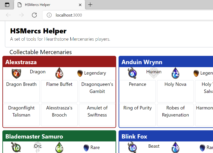
Creating a handful of components to render the data that loaded from a JSON file was covered in the previous post. It can feel a little defeating to just have a dump of content without any style to it. This step of the tutorial will cover implementing TailwindCSS to our project and adding some basic styling.

The fourth in a series of posts on 'HSMercs Helper From Scratch', a tutorial for recreating HSMercs Helper.
The native tutorial for installing Tailwind CSS with Vue 3 and Vite is straightforward and easy to follow. Most of what you'll see in this post is following the steps in that post.
yarn add -D tailwindcss postcss autoprefixerPostCSS is a tool for transforming styles with JS plugins. These plugins can lint the CSS, support variables and mixins, transpile future CSS syntax, create inline images, and more. The Autoprefixer plugin parses CSS and adds vendor prefixes to CSS rules using values from Can I Use. Together, these provide the functionality that Tailwind uses to pump out the CSS we need it to.
The official tutorial now instructs you to run the command yarn tailwindcss init -p which creates a postcss.config.js file for PostCSS configuration and a tailwind.config.js file for Tailwind specific configuration.
postcss.config.js
module.exports = {
  plugins: {
    tailwindcss: {},
    autoprefixer: {},
  },
};
This tells PostCSS to utilize the tailwindcss and autoprefixer plugins.
tailwind.config.js
module.exports = {
  content: ["./index.html", "./src/**/*.{vue,ts}"],
  theme: {
    extend: {},
  },
  plugins: [],
};
Additional configuration is provided to TailwindCSS informing it to parse the root /index.html file and all .vue and .ts files anywhere under the src folder.
src/index.css
@tailwind base;
@tailwind components;
@tailwind utilities;
These three layers are where PostCSS and Autoprefixer inject the styles that Tailwind generates.
src/main.ts
  import { createApp } from 'vue'
  import App from './App.vue'
+ import './index.css'
  import { store } from './store'


  createApp(App)
      .use(store)
      .mount('#app')
The main script file loads the Tailwind generates CSS file into the full app. All of the magic happens behind the scenes, so we won't go into the details on how or why this happens. We're just happy it works.
src/App.vue
  <template>
+   <header class="ml-4 p-4 rounded-bl-md border-l-2 border-b-2">
+     <div class="text-2xl font-extrabold">HSMercs Helper</div>
+     <div class="font-light">A set of tools for Hearthstone Mercenaries players.</div>
    </header>
    <Mercenaries></Mercenaries>
  </template>
This applies a little styling to the header section of the app. Eventually, we will be putting navigation to different tools up there, so it is nice to give it some visual separation.
src/components/Mercenaries.vue
<template>
  <section>
+   <h1 class="text-xl mx-8">Collectable Mercenaries</h1>
+   <div class="flex flex-wrap gap-2 px-2">
      <MercenaryCard
        v-for="(merc, mercName) in mercenaries"
        :key="mercName"
        v-bind="merc"
        >{{ mercName }}
      </MercenaryCard>
    </div>
  </section>
</template>
When there is a set of cards, and we don't particularly care how many are in a row, the best case is to use flex on the container, instructing the browser to place entries next to each other, and wrap (flex-wrap) onto the next line when the block element won't fit in the viewport. px-2 means to put a small padding on the left and right side of the container and gap-2 instructs flex to keep a small space between elements.
yarn dev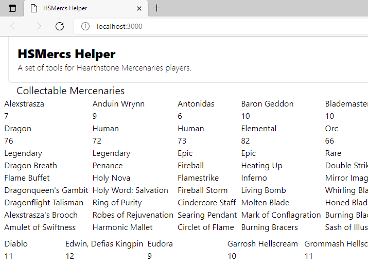
One of this first things I panicked on when I first installed Tailwind was that all of my text was suddenly the same size. What did I screw up?!
Well, fear not; this is intentional. The directive @tailwind base contains reset rules (called Preflight)that clear all of the browser defaults. Since each browser has slightly different default stylying, the first thing Tailwind does is strip it all out.
Style Some More Components
Most of the styling is going to be inside the Mercenary Card or one of its children. We can start by throwing around a couple classes and seeing what happens. Now is a good time to experiment and see what you like. This first pass doesn't involve adding any color or images, it is strictly to improve readability of the basic content.
src/components/MercenaryCard.vue
<template>
  <div
+   class="grid grid-rows-3 w-96 rounded-md border-2 gap-y-1 pb-1"
  >
    <div>
      <div
+       class="flex justify-between px-2 py-1 text-white bg-gray-700"
      >
+       <h2 class="font-bold text-xl whitespace-nowrap">
          <slot />
        </h2>
      </div>
+     <div class="grid grid-cols-5 justify-around place-items-center px-2">
        <Attack :role="role" :attack="attack" />
        <Tribe :tribe="tribe" />
        <Health :role="role" :health="health" />
+       <Rarity class="col-span-2" :rarity="rarity" />
      </div>
    </div>
+   <div class="grid grid-cols-3 gap-x-1">
      <AbilityStamp
        v-for="(ability, abilityName) in abilities"
        :key="abilityName"
        :ability="ability"
        class="rounded"
        >{{ abilityName }}
      </AbilityStamp>
    </div>
+   <div class="grid grid-cols-3 gap-x-1">
      <ItemStamp
        v-for="(item, itemName) in equipment"
        :key="itemName"
        :item="item"
        >{{ itemName }}
      </ItemStamp>
    </div>
  </div>
</template>
This right here is why I think CSS is so frickin' cool. We made a small adjustment to the CSS and BOOM, it looks so incredibly different. I get excited when I start seeing things really begin to take shape.
I hope you're getting excited, too.
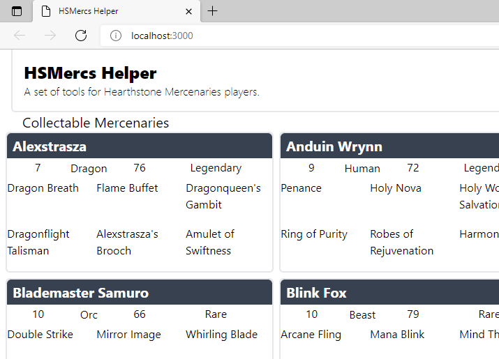
Let's do a some touch-up here and there by going into some of the components and applying a little style.
src/components/AbilityStamp.vue
<template>
+ <div class="border rounded text-sm sm:text-base text-center">
    <slot />
  </div>
</template>
src/components/Attack.vue
<template>
+ <div class="text-center font-bold w-10 h-10 text-xl p-2">
    {{ attack }}
  </div>
</template>
src/components/Health.vue
<template>
+ <div class="text-center font-bold w-10 h-10 text-xl p-2">
    {{ health }}
  </div>
</template>
src/components/ItemStamp.vue
<template>
+ <div class="border rounded text-sm sm:text-base text-center">
    <slot />
  </div>
</template>
src/components/Tribe.vue
<template>
+ <div class="whitespace-nowrap text-center">
+   <span class="align-middle">{{ tribe }}</span>
  </div>
</template>
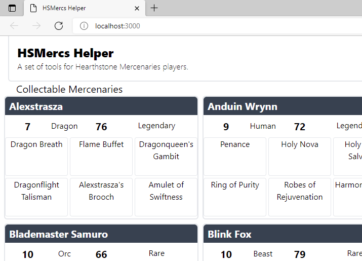
Those little touches don't add much, but they set us to for the next stage in styling, which is to start having fun with dynamic colors and images based on properties of the mercenary.
Time For Some Images
All this grey and white and boxes is getting boring. The excitement is starting to wear off. Time to add some pictures into this. Head over to the repo for this project and download the images from the "/assets/" folder. It's safe to grab all of the images in that folder, but if you want to be selective, these are the ones we are going to work with first.
Assets Folder
├── assets
│   ├── alliance-watermark.png
│   ├── caster-attack.png
│   ├── caster-health.png
│   ├── epic.png
│   ├── fighter-attack.png
│   ├── fighter-health.png
│   ├── horder-watermark.png
│   ├── legendary.png
│   ├── neutral-attack.png
│   ├── neutral-health.png
│   ├── protector-attack.png
│   ├── protector-health.png
│   ├── rare.png
Be sure to place the assets folder at the root.
src/components/Attack.vue
<template>
  <div
+   class="bg-center bg-contain bg-no-repeat text-center font-bold text-white w-10 h-10 text-xl p-2"
+   :style="{
+     'background-image': `url('/assets/${role.toLowerCase()}-attack.png')`,
+   }"
  >
    {{ attack }}
  </div>
</template>
src/components/Health.vue
<template>
  <div
+   class="bg-center bg-contain bg-no-repeat text-center font-bold text-white w-10 h-10 text-xl p-2"
+   :style="{
+     'background-image': `url('/assets/${role.toLowerCase()}-health.png')`,
+   }"
  >
    {{ health }}
  </div>
</template>
If you've left the vite server running, your place should be autorefreshing with the new content when you save the Vue files. If not, go ahead and start it up, now. You can see how the affect of the role property plays out by dynamically setting the URL of the background image.
src/components/Rarity.vue
<template>
  <div>
+   <img
+     class="max-h-6 inline"
+     :src="`./assets/${rarity.toLowerCase()}.png`"
+     :alt="rarity"
+   />
    {{ rarity }}
  </div>
</template>
Tailwind's Preflight sets the img to display:block, so we need to set it back to inline for this instance. The max-h-6 is there to keep the image contained. We could also set an explicit height or width, but I prefer telling it the maximum allowed size and if the container shrinks, then the image will scale, too.
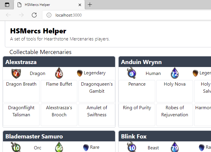
Tailwind Custom Colors
The next style we are going to implement is to color the border and the top bibbon of each card based on the class. Looking through Tailwind's default color palette, the colors red-800, green-800, and blue-800 seem to nicely fit with the Mercenaries color palette. However, instead of having to remember which color we picked for each class, and which shade is the right one, Tailwind allows us to create custom named colors.
tailwind.config.js
+ const colors = require("tailwindcss/colors");

  module.exports = {
    content: ["./index.html", "./src/**/*.{vue,ts}"],
    theme: {
      extend: {
+       colors: {
+         protector: colors.red[800],
+         fighter: colors.green[800],
+         caster: colors.blue[800],
+       },
      },
    },
    plugins: [],
  };
The Tailwind compiler (and the VSCode Intellisense) now know that "protector", "fighter", and "caster" are valid colors.
src/components/MercenaryCard.vue
<template>
  <div
    class="grid grid-rows-3 w-96 rounded-md border-2 gap-y-1 pb-1"
+   :class="{
+     'border-protector': role == 'Protector',
+     'border-fighter': role == 'Fighter',
+     'border-caster': role == 'Caster',
+   }"
  >
    <div>
      <div
        class="flex justify-between px-2 py-1 text-white bg-gray-700"
+       :class="{
+         'bg-protector': role == 'Protector',
+         'bg-fighter': role == 'Fighter',
+         'bg-caster': role == 'Caster',
+       }"
      >
        <h2 class="font-bold text-xl whitespace-nowrap">
          <slot />
        </h2>
      </div>
...
    </div>
...
  </div>
</template>
How cool is that?! Using the role prop, Vue assigns the right border and background class to use. Tailwind knows to generate the appropriate CSS class to match the colors we want.
Tribe & Faction
There is a concept in Mercenaries PVE where some tribes are a part of the "Alliance" faction, others are in the "Horde", and the rest are neutral or without a faction. Instead of doing a long set of logic in the <template> block, we'll create a computed property that will evaluate the faction based on the mercenary's tribe.
src/components/Tribe.vue
  <template>
    <div
+     class="bg-center bg-no-repeat bg-contain h-10 whitespace-nowrap min-w-[6rem] text-center"
+     :style="{
+       'background-image': backgroundImage,
+     }"
    >
      <span class="align-middle">{{ tribe }}</span>
    </div>
  </template>
  <script setup lang="ts">
+ import { computed } from "vue";

  const props = defineProps({
    tribe: {
      type: String,
    },
  });

+ const horde = ["Blood Elf", "Goblin", "Half-Orc", "Orc", "Tauren", "Troll", "Undead"];
+ const alliance = ["Draenei", "Dwarf", "Gnome", "High Elf", "Human", "Night Elf"];
+
+ const faction = computed(() => {
+   return horde.find(t => t === props.tribe)
+     ? "Horde"
+     : alliance.find(t => t === props.tribe)
+     ? "Alliance"
+     : "Neutral";
+ });

+ const backgroundImage = computed((): string => {
+   if (faction.value === "Horde" || faction.value === "Alliance") {
+     return `url('/assets/${faction.value.toLowerCase()}-watermark.png')`;
+   }
+   return "unset";
+ });
  </script>
The two arrays tell us which tribes are in which factions and the faction computed property does a quick look-up. We then utilize that value to drive the background-image style for the div.
