First Rudimentary Mercenary Components
Published:
Filed under: Rovani's Vue
In the previous step, we took the first pass at the Vuex store by creating a getter and a mutation to interact with the state. For the next step, we will load the data and create and initial round of components to render the data to the client.

The third in a series of posts on 'HSMercs Helper From Scratch', a tutorial for recreating HSMercs Helper.
Minimum Renderable Mercenaries
There are a lot of directions that we could go to get something renderable. The goal is to have as little "temporary" code that is in place just to have something display, which then gets deleted or overwritten later.
static/mercenaries.json
{
    "mercenaries": {
        "Alexstrasza": {
            "role": "Protector",
            "rarity": "Legendary",
            "tribe": "Dragon",
            "attack": 7,
            "health": 76,
            "abilities": {
                "Dragon Breath": {},
                "Flame Buffet": {},
                "Dragonqueen's Gambit": {}
            },
            "equipment": {
                "Dragonflight Talisman": {},
                "Alexstrasza's Brooch": {},
                "Amulet of Swiftness": {}
            },
            "tasks": [
                {}
            ]
        }
    }
}
This JSON sample is a minimal view of what the entire file looks like. The complete mercenaries.json file can be found at the Github repo for the HSMercs Helper project, and I suggest you download that to the src/static folder. At 18,000+ lines of JSON, it is a sizable file.
src/components/Mercenaries.vue
<template>
  <section>
    <h1>Collectable Mercenaries</h1>
    <div>
      <MercenaryCard
        v-for="(merc, mercName) in mercenaries"
        :key="mercName"
        v-bind="merc"
        >{{ mercName }}
      </MercenaryCard>
    </div>
  </section>
</template>
<script lang="ts">
import { defineComponent } from "vue";
import { MercCollection } from "../models/mercCollection";
import mercjson from "../static/mercenaries.json";
import { SET_MERCENARIES } from "../store/types";

export default defineComponent({
  computed: {
    mercenaries(): MercCollection {
      return this.$store.getters.getMercenaries;
    },
  },
  mounted(): void {
    if (Object.keys(this.mercenaries ?? {}).length === 0) {
      this.$store.commit(SET_MERCENARIES, mercjson.mercenaries);
    }
  },
});
</script>
We have created a component that, when it is mounted, will check to see if there is data in the store and if not, commit a write. The computed property mercenaries returns an object that looks like a MercCollection and retrieves it from the store. The component iterates over the collection and renders a MercenaryCard component.
tsconfig.json
{
    "compilerOptions": {
        "module": "CommonJS",
        "moduleResolution": "Node",
        "esModuleInterop": true,
+       "resolveJsonModule": true,
    },
    "exclude": [
        "./node_modules/",
        "./dist/"
    ]
}
TypeScript allows for importing modules with a '.json' extension, which is common practice in Node projects. To enable this option, though, we need to update the configuration file. TypeScript's reasoning for explicitly enabling this is because it can result in memory intensive delays if the JSON file is too large or complicated. By forcing a developer to opt-in, the presumption is that the developer understands these risks.
src/main.ts
  import { createApp } from 'vue'
  import App from './App.vue'
+ import { store } from './store'


createApp(App)
+   .use(store)
    .mount('#app')
While we had created the Vuex store, we haven't yet made it available to the Vue application. Popping it in like this is the easiest way to get it globally accessible. Vue and Vuex work together to make the store available as a $store property on every component.
src/env.d.ts
  /// <reference types="vite/client" />

+ import { DefineComponent } from 'vue'
+ import { Store } from 'vuex'
+ import { State } from './store/state'

  declare module '*.vue' {
      // eslint-disable-next-line @typescript-eslint/no-explicit-any, @typescript-eslint/ban-types
      const component: DefineComponent<{}, {}, any>
      export default component
  }

+ declare module '@vue/runtime-core' {
+     interface ComponentCustomProperties {
+         $store: Store<State>
+     }
+ }
This is another one of those Tooling Updates that occassionally needs to be added so TypeScript doesn't freak out whenever it sees this.$store in the code. All components extend the ComponentCustomProperties interface that Vue exposes through the @vue/runtime-core module. Because TypeScript allows interfaces to be extended by just redeclaring it, developers are able to describe the custom properties of components by building on this interface. Thus, we can inform TypeScript that $store is an instance of the Store<State> that we created (found in "src/store/index.ts").
src/App.vue
  <script setup lang="ts">
+ import Mercenaries from "./components/Mercenaries.vue";
  </script>

  <template>
    <header>
      <div>HSMercs Helper</div>
      <div>A set of tools for Hearthstone Mercenaries players.</div>
    </header>
+   <Mercenaries></Mercenaries>
  </template>
Now that the Mercenaries component has been built, the App component needs to be informed of it and told where to place it. And that's it!
src/components/MercenaryCard.vue
<template>
  <h2>
    <slot />
  </h2>
</template>
<script lang="ts">
import { defineComponent } from "vue";

export default defineComponent({
  props: {
    role: String,
    tribe: String,
    rarity: String,
    attack: Number,
    health: Number,
    abilities: Object,
    equipment: Object,
    tasks: Array,
  }
});
</script>
Since we already know what properties are coming with each Mercenary, we can create the components props right away.
yarn test
yarn dev
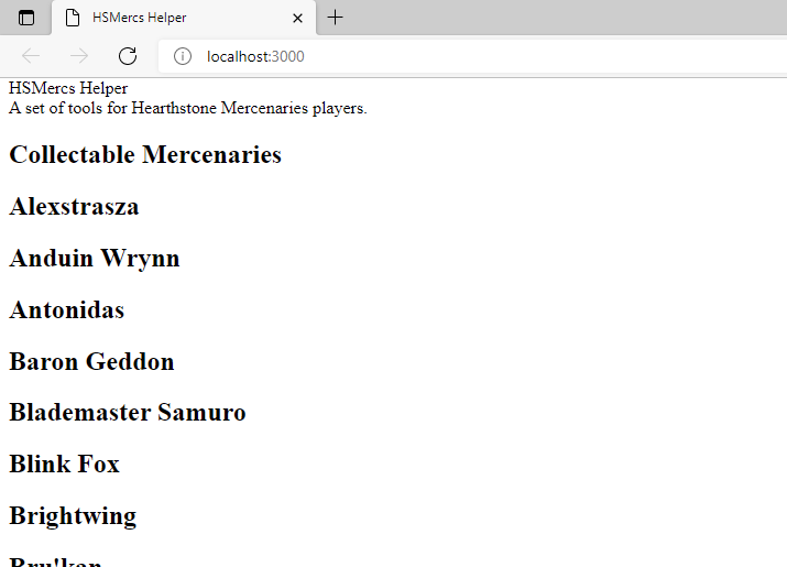
Now is a good time to validate that everything works. We should now have a list of all of the mercenaries!

Lots of New Components!
It can be important to develop a common language when creating sets of components so that future developers (including yourself) know the purpose of everything that is developed. Otherwise, components may get remade as teams forget what is out there and end up recreating existing functionality.
[Component].vueis for an atomic piece of data or presentation element.[Component]Stamp.vueis a small version of a data object. It doesn't have an much information as a full details view would, but it isn't useful to stand alone.[Component]Card.vuedisplays a compact set of information, made up of multipleComponentorComponentStampcomponents.[Component]Details.vuecontains an indepth display of the object, consiting ofComponent,ComponentStamp, and perhaps someComponentCardcomponents.
src/components/Role.vue
<template>
  <div>
    {{ role }}
  </div>
</template>

<script lang="ts">
import { defineComponent } from "vue";

export default defineComponent({
  props: {
    role: {
      type: String,
      required: true,
    },
  },
});
</script>
There are going to be a lot of components that all look extremely similar. There is a single div that holds the one prop being passed to the component. We specify the type of the prop and whether it is required. By having all of these as individual components now, we will be able to add styling, computation, and features in the future without having to refactor the parent component by extracting this information later.
src/components/Tribe.vue
<template>
  <div>
    {{ tribe }}
  </div>
</template>

<script setup lang="ts">
defineProps({
  tribe: {
    type: String,
    required: true,
  },
});
</script>
src/components/Rarity.vue
<template>
  <div>
    {{ rarity }}
  </div>
</template>

<script setup lang="ts">
defineProps({
  rarity: {
    type: String,
    require: true,
  },
});
</script>
src/components/Attack.vue
<template>
  <div>
    {{ attack }}
  </div>
</template>

<script lang="ts">
import { defineComponent } from "vue";

export default defineComponent({
  props: {
    attack: {
      type: Number,
      required: true,
    },
    role: {
      type: String,
      default: "Neutral",
    },
  },
});
</script>
The attack and health components will also accept a role string prop because we know there will be different styling based on that value. In order to accomodate non-mercenaries (i.e. summoned minions), the prop comes with a default value. It is better to specify the default value in the component than expect all consumers of the component to remember to set and spell a default correctly.
src/components/Health.vue
<template>
  <div>
    {{ health }}
  </div>
</template>

<script lang="ts">
import { defineComponent } from "vue";

export default defineComponent({
  props: {
    health: {
      type: Number,
      required: true,
    },
    role: {
      type: String,
      default: "Neutral",
    },
  },
});
</script>
Stub Components
The ability and item components will be the most complicated components. They have descriptions, tiers of affects, different ways equipped items affect abilities, and other features that will get added piecemeal. However, in order to get to our Minimum Renderable Mercenary, the first pass is just going to display the name of the ability and item.
src/components/AbilityStamp.vue
<template>
  <div>
    <slot />
  </div>
</template>

<script lang="ts">
import { defineComponent } from "vue";

export default defineComponent({
  props: {
    ability: {
      type: Object,
      required: true,
    },
  },
});
</script>
src/components/ItemStamp.vue
<template>
  <div>
    <slot />
  </div>
</template>

<script lang="ts">
import { defineComponent } from "vue";

export default defineComponent({
  props: {
    item: {
      type: Object,
      require: true,
    },
  },
});
</script>
Displaying Mercenary Data
All of the initial components have now been built. Heading back to the mercenary card component, we import each of these components and give them a place.
src/components/MercenaryCard.vue
<template>
  <div>
    <div>
      <div>
        <h2>
          <slot />
        </h2>
        <Role :role="role" />
      </div>
      <div>
        <Attack :role="role" :attack="attack" />
        <Tribe v-if="tribe" :tribe="tribe" />
        <Health :role="role" :health="health" />
        <Rarity :rarity="rarity" />
      </div>
    </div>
    <div>
      <AbilityStamp
        v-for="(ability, abilityName) in abilities"
        :key="abilityName"
        :ability="ability"
        >{{ abilityName }}
      </AbilityStamp>
    </div>
    <div>
      <ItemStamp
        v-for="(item, itemName) in equipment"
        :key="itemName"
        :item="item"
        >{{ itemName }}
      </ItemStamp>
    </div>
  </div>
</template>
<script lang="ts">
import { defineComponent } from "vue";
import AbilityStamp from "./Ability.vue";
import Attack from "./Attack.vue";
import Health from "./Health.vue";
import ItemStamp from "./Item.vue";
import Rarity from "./Rarity.vue";
import Role from "./Role.vue";
import Tribe from "./Tribe.vue";

export default defineComponent({
  props: {
    role: String,
    tribe: String,
    rarity: String,
    attack: Number,
    health: Number,
    abilities: Object,
    equipment: Object,
    tasks: Array,
  },
  components: {
    AbilityStamp,
    Attack,
    Health,
    ItemStamp,
    Rarity,
    Role,
    Tribe,
  },
});
</script>
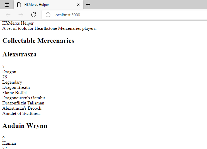
Everything is in place. Save the files and start the dev server back up!
yarn dev
Step 4: Adding Some Style
The output is boring to look at and requires a very long scroll. Let's add some styling to this project using Tailwind CSS.